carrd resources
pixels + bgs + codes + graphics + other
updated on 7/3/25
home
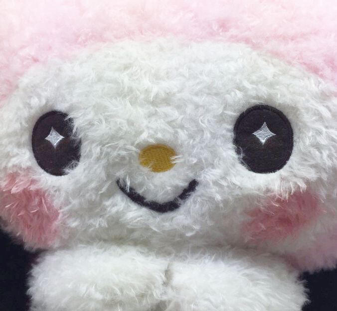
sanrio


pokemon


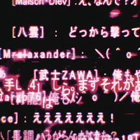
misc


flags


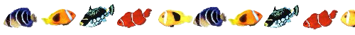
animals


spirals


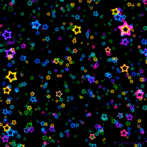
stars


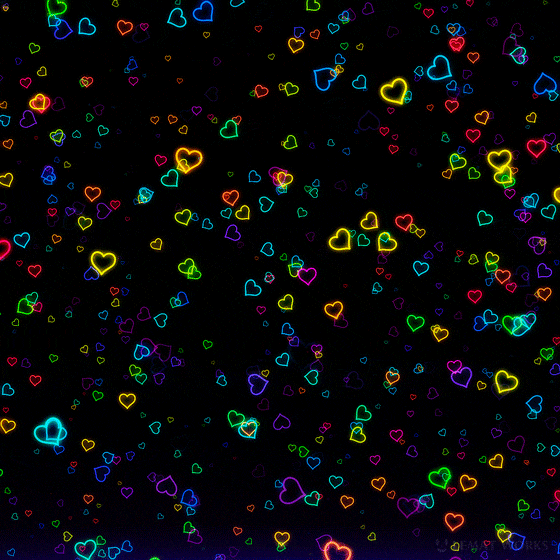
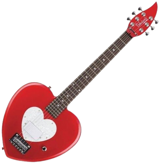
hearts


red


orange - yellow


green

blue


purple


pink


rainbow


black - white


groups


angelcore


home
white bg


spirals


misc

home
border: double 4px #000000;text-shadow: -1.5px 0 #000000, 0 2.5px #000000, 2.5px 0 #000000, 0 -1.5px 0 #000000;font-weight: bold;

height: 75px;
overflow: scroll;
overflow-x: hidden;

position: absolute;
top: -0.5em;
left: -0.5em;
z-index: 50;

<style>
#askew {
-ms-transform: rotate(5deg); /* IE 9 */
transform: rotate(5deg);
}
</style>

<style>#whitelacescroll {
border-width:7px;
border-style:solid;
border-image: url("https://media.discordapp.net/attachments/826854899013648384/839700444375810078/tumblrinlineo98n9dbCl61u2r0ws5401_2.png") 8 fill round;
height: 200px;
width: 100%;
padding: 10px;
font-size:125%;
color: #000;
overflow: auto;
}
</style>

<style>
#tilting {
animation: floaty 1s infinite alternate;
}@keyframes floaty {
from { transform: rotate(5deg); }
to { transform: rotate(-5deg); }
}
</style>

<style>
.jerking {
animation: jerk 0.5s infinite;
}@keyframes jerk {
0% {
transform: rotate(1deg);
}
50% {
transform: rotate(1deg);
}
51% {
transform: rotate(-1deg);
}
100% {
transform: rotate(-1deg);
}
}
</style>

<style>
#heart {
-webkit-mask-image: url(https://i.imgur.com/bIX4M8u.png);
-webkit-mask-size: contain;
-webkit-mask-repeat: no-repeat;
-webkit-mask-position: center;
}
</style>

<style>
{
/* Start the shake animation and make the animation last for 0.5 seconds /
animation: shake 0.5s;
/ When the animation is finished, start again */
animation-iteration-count: infinite;
}
@keyframes shake {
0% { transform: translate(1px, 1px) rotate(0deg); }
10% { transform: translate(-1px, -2px) rotate(-1deg); }
20% { transform: translate(-3px, 0px) rotate(1deg); }
30% { transform: translate(3px, 2px) rotate(0deg); }
40% { transform: translate(1px, -1px) rotate(1deg); }
50% { transform: translate(-1px, 2px) rotate(-1deg); }
60% { transform: translate(-3px, 1px) rotate(0deg); }
70% { transform: translate(3px, 1px) rotate(-1deg); }
80% { transform: translate(-1px, -1px) rotate(1deg); }
90% { transform: translate(1px, 2px) rotate(0deg); }
100% { transform: translate(1px, -2px) rotate(-1deg); }
}
</style>

<style>
#pop {
text-shadow: -1px 0 #000, 0 1px #000, 1px 0 #000, 0 -1px #000, 0 0;
font-style: italic;
font-size:2em;
font-weight:bold;
color: #fff;
-webkit-animation: pop 1s ease-in-out infinite alternate;
animation: pop 1s ease-in-out infinite alternate;
-moz-animation: pop 1s ease-in-out infinite alternate;
}
@keyframes pop {
from {
transform:scale(0.95)
}
50% {
transform:scale(1)
}
to {
transform:scale(0.95)
}
}
@-webkit-keyframes pop {
from {
-webkit-transform:scale(0.95)
}
50% {
-webkit-transform:scale(1)
}
to {
-webkit-transform:scale(0.95)
}
}
</style>
<div id="pop">TEXT</div>

<style>
#float {
text-shadow: -1px 0 #000, 0 1px #000, 1px 0 #000, 0 -1px #000, 0 0;
font-style: italic;
font-size:2em;
font-weight:bold;
color: #fff;
animation-name: floating;
animation-duration: 3s;
animation-iteration-count: infinite;
animation-timing-function: ease-in-out;
}@keyframes floating {
0% { transform: translate(0, 0px); }
50% { transform: translate(0, 15px); }
100% { transform: translate(0, -0px); }
}</style>
<div id="float">floating text</div>

<style>
a:hover {
webkit-filter: blur(0.5px);
filter: blur(2px);
}
</style>

home
pngs


kaomojis


big misc


dividers


home
stamps / blinkies / buttons